First, thanks very much for your efforts and this how to! Do you have an idea of how much frustration this solves for MANY users??

You know, this and the other very few sites mentioned that discuss this issue:
->
http://mysite.verizon.net/vze8992v
->
http://convexhull.com/mandrake_fonts.html
->
http://avi.alkalay.net/linux/docs/font-howto/Font.html (which is quite comprehensive IMHO; except that I personally disagree with the size at which they say AA should be enabled. They say 10pt, for me it's 14 pt)
really really should be a sticky or have a dedicated section in the Wiki

I say this because just about every other site/page concerned with fonts, such as the famous FDU howto, all takes the
opposite approach--the anti-aliased way. The truetype bytecode interpreter was designed in the first place
NOT to be used with anti-aliasing.
In other words, it is the only way so far to produce
unaliased renderings from outline/scalable fonts without anti-aliasing. I say "unaliased" because the path or shape of the font onscreen is exactly like how the font--specifically the embedded bytecode program--meant it to be. Simply disabling anti-aliasing for fonts under a certain size, like most of the advice given elsewhere, always produces aliased renderings for the standard *nix configuration without all this extra work.
<RANT>If the following two pics don't make folks hate the eye straining, headache inducing, space wasting AA like I do, then the only reason I can think of is that they must be using pretty large fonts so this whole issue won't matter much, if any, to them anyways.
It's a little ironic that Apple holds the TT bytecode patent because it doesn't seem to be used with OSX (if it is, then it's wasted with anti-aliasing). In fact I've read the blog of a freetype programmer commenting on how bad anti-aliased fonts look on a low res (1024x768) Apple laptop (well, that's another downside to anti-aliasing: it looks even worse with lower resolution as the smoothing/blurring/gradient artifacts become more obvious--you can easily see for yourself at 1024x768 or less)</RANT>
(..sorry about that, had to get it off my chest.. )
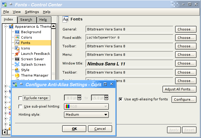
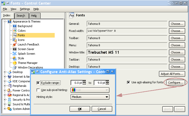
KDE control center pics from
http://avi.alkalay.net/linux/docs/font-howto/Font.html
anti-aliasing, the "popular" Bitstream Vera:
anti-anti-aliasing, MS style:
====================================================
P.S. The other thing I should mention is that the other way to get sharp small fonts is to use bitmap fonts. Type 1 fonts for example, allow for a bitmap part and a outline part (specified in postscript). the bitmap part is meant for screen display and the outline part is meant for printing. Real
Adobe fonts like their Helvetica, Times and Courier, and certain MS fonts I believe (like Gothic) have embedded bitmaps.
However if I understand correctly, by default fontconfig will use the outline part for screen display. This is not the case though in Suse (at the professional version). You can get nice sharp--though limited--fonts simply by switching to "Adobe" everything. If not but your /etc/fonts/fonts.conf or /etc/fonts/local.conf
already has the necessary code to switch to bitmap for certain fonts, and is simply awaiting the "prefer_bitmap" variable, change in your $HOME/.fonts.conf or /etc/fonts/fonts.conf or /etc/fonts/local.conf :
Code:
  <match target="pattern">
	<edit name="prefer_bitmap">
		<bool>true</bool>
	</edit>
  </match>


 . Another choice is to not upgrade. This is of course much easier to do if freetype is packaged seperately as it is with Dropline.
 )
) ) and if i have any (more?) positive results i'll post here.
